Non Mi Uccidere
Design to fade
Client: Warner Bros Italy, Vivo Film. Year:2021

Overview
Title sequence and Logotitle design for the movie "Non Mi Uccidere" from the Director Andrea de Sica produced by Vivo Film & Warner Bros Italy.
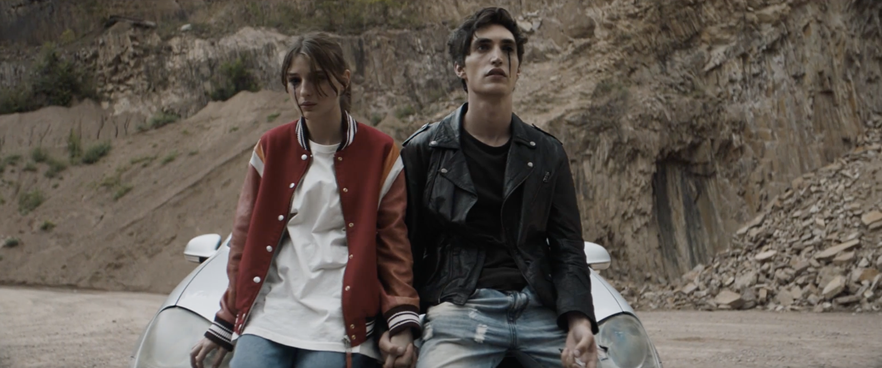
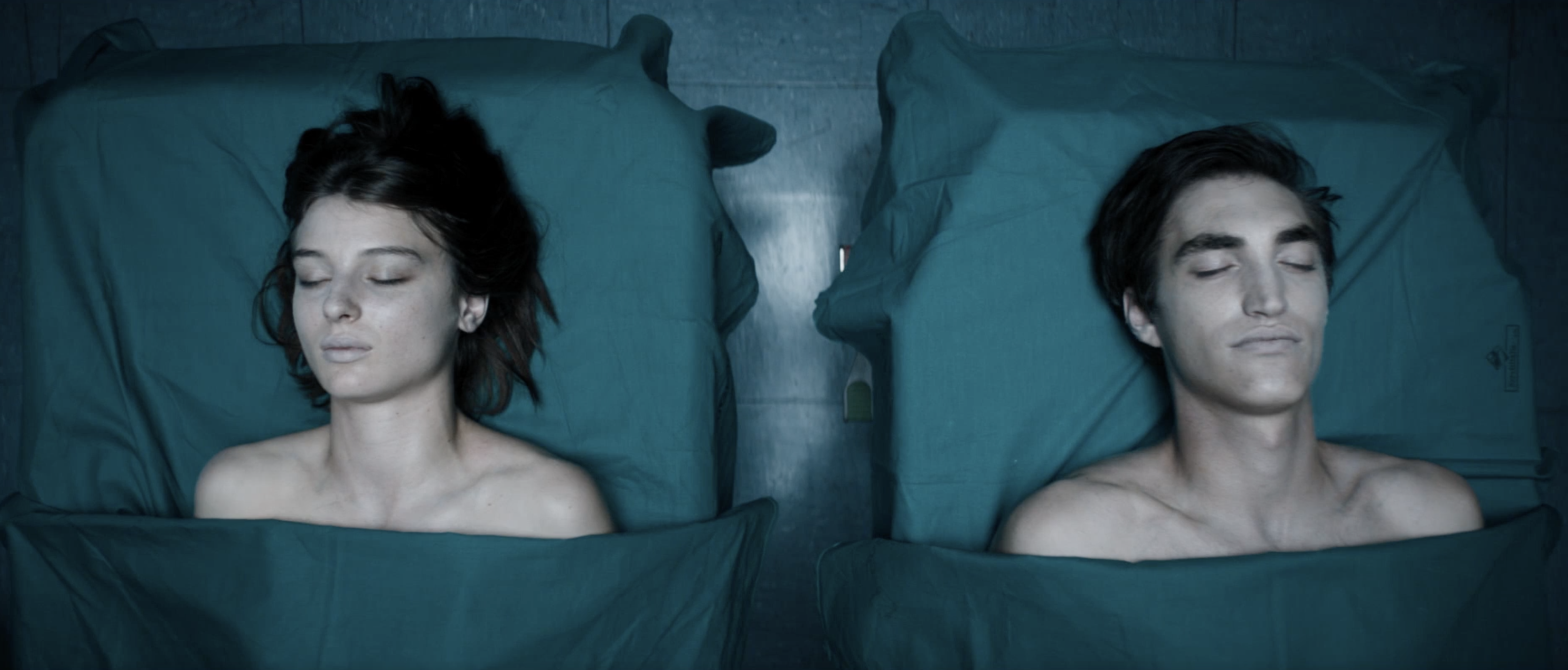
An horror film with a teen romancer twist about a 19-year-old named Mirta, who, with her older lover, Robin, dies of a drug overdose. She then recovers alone to find out that in order to continue living, and cherishing the memory of Robin’s love, she must eat living humans.
Puma is introducing a collection of biodegradable sportswear, aptly named Design to Fade, as part of VDF's collaboration with Ventura Projects for the Milan Design Week. Developed with the support of biodesign specialists Streamateria and Living Colour, the collection features biodegradable clothing that is dyed using bacteria and can be manufactured on demand to reduce waste.
Hired by IXD Milan (spin off of MIT)
Role
Creative Director - Freelance.
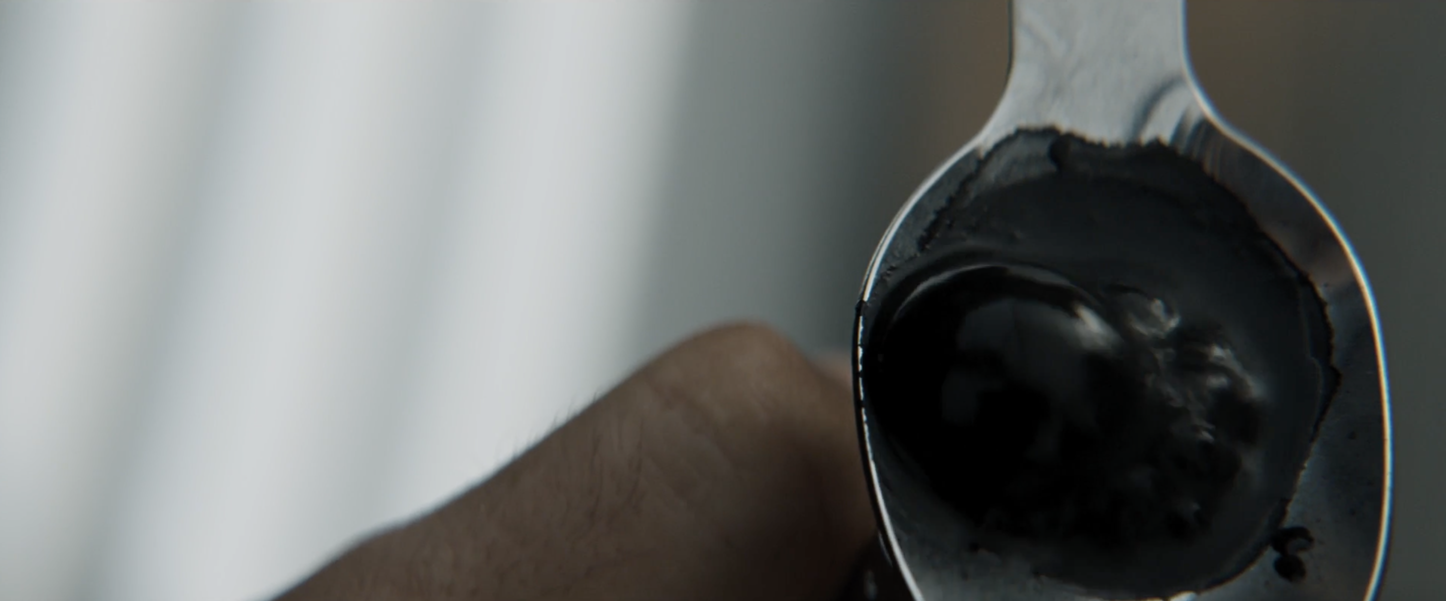
Working in conjunction with the Director, the whole concept for the sequence and overall design is based on the human biology and the creation / destruction of them.
The sequence it's visualising what happens in after the drug overdose in a decay that brings back a dark life.
Ideation process
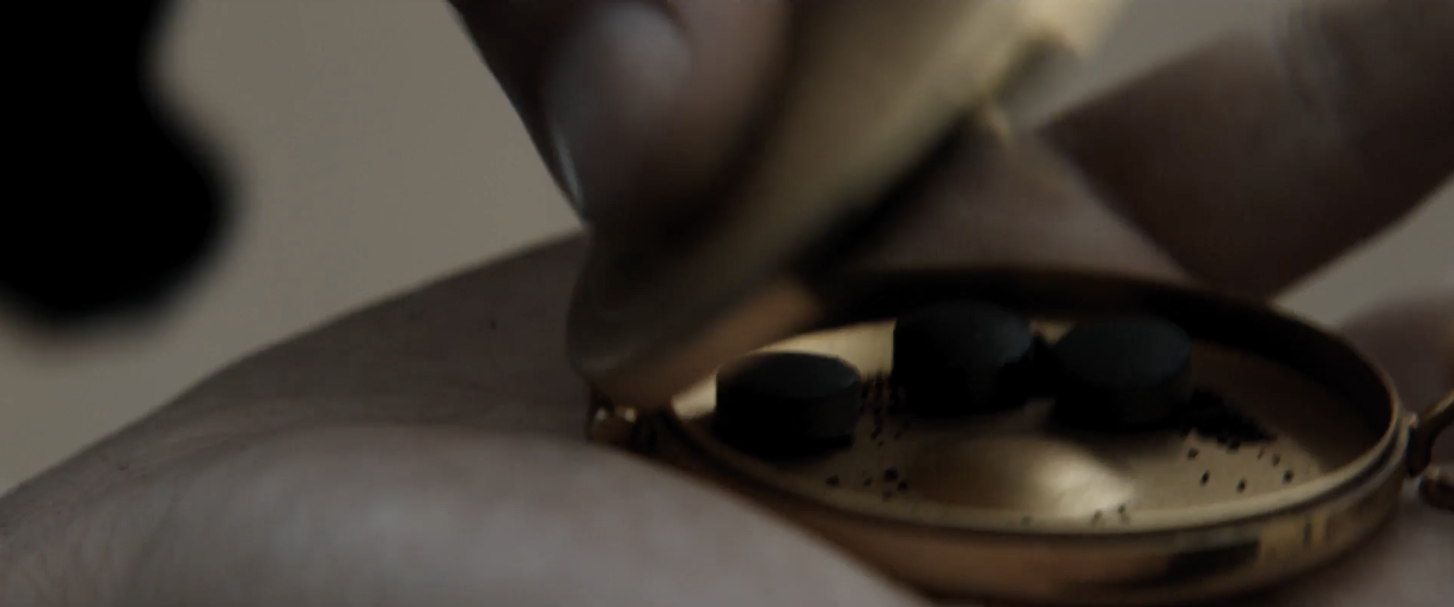
The Location
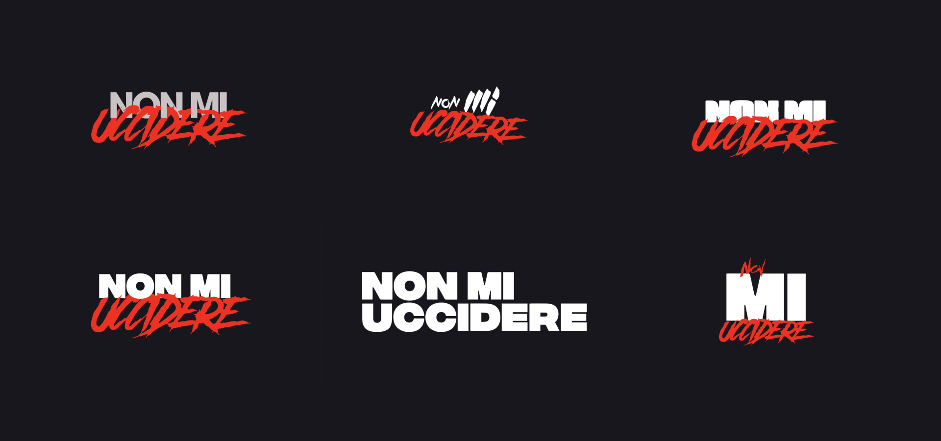
Initial discovery of typography combination and balance for the logotitle definition, as a step forward benchmark, inspiraion and discovery phase brainstorming with the director and production team,
†
Exploring typography combination with clear connection of 80's Horror artworks, providing a sense of modernity in the combianation of minimal bold typography.
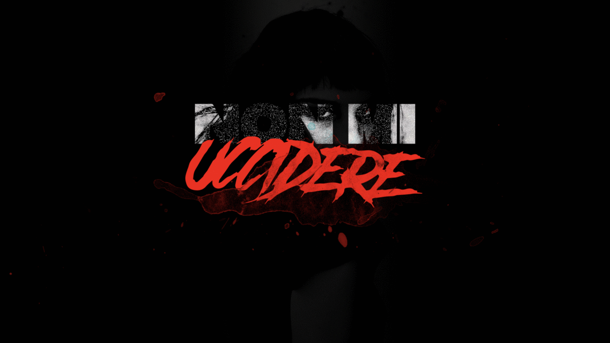
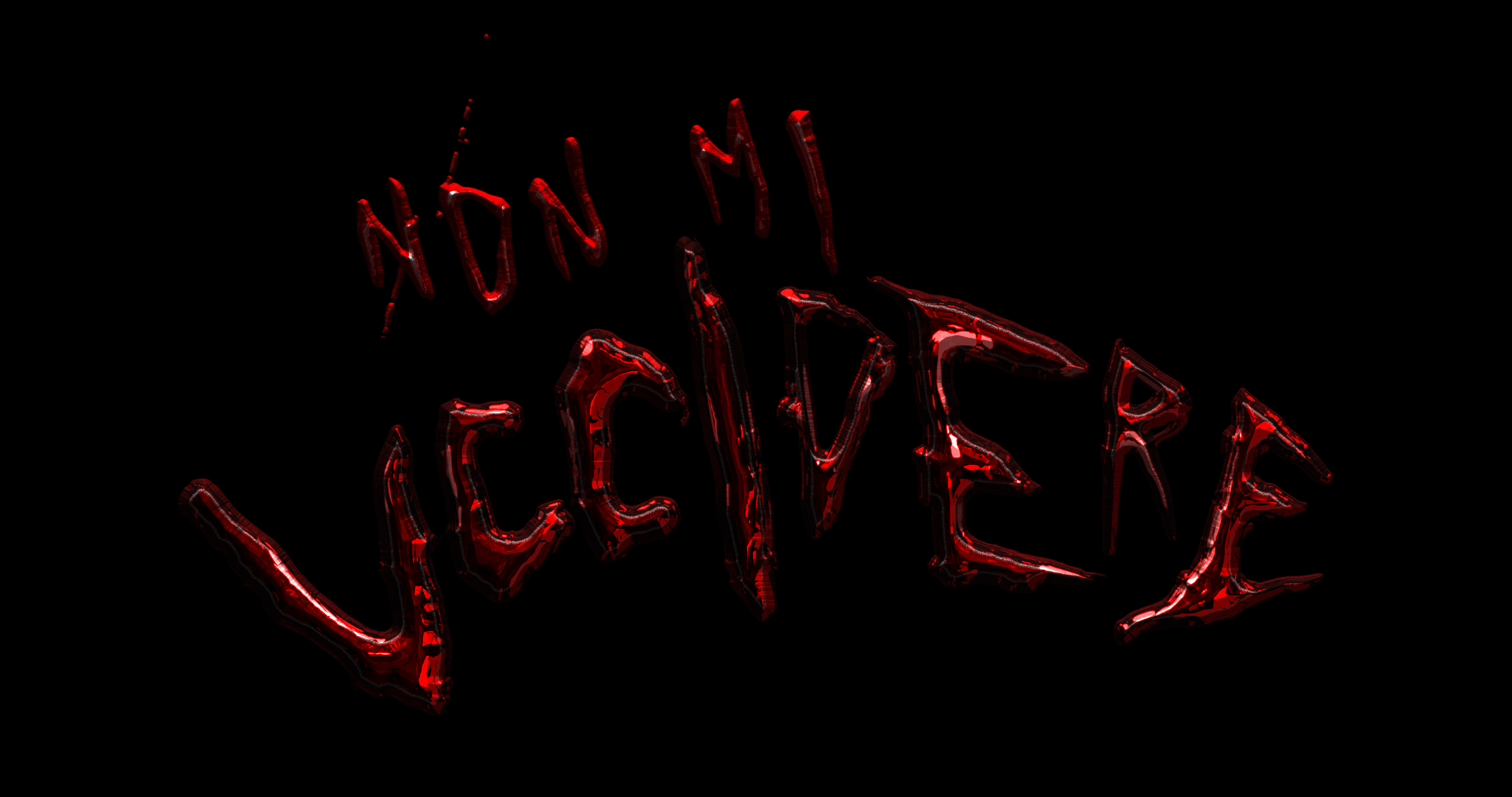
Going forward with the exploration designing an handmade typography, converting it in 3d and using materials rendering delivering a sense of decay on the typography itself.
At the Exibion end, POV when turing to the exit reveal an old polariod frame to take a picture of the whole discovere collection. Promoting sharaility on social network.
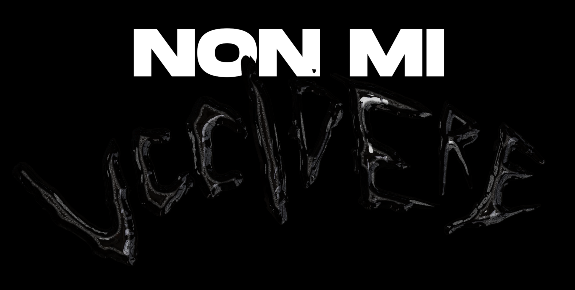
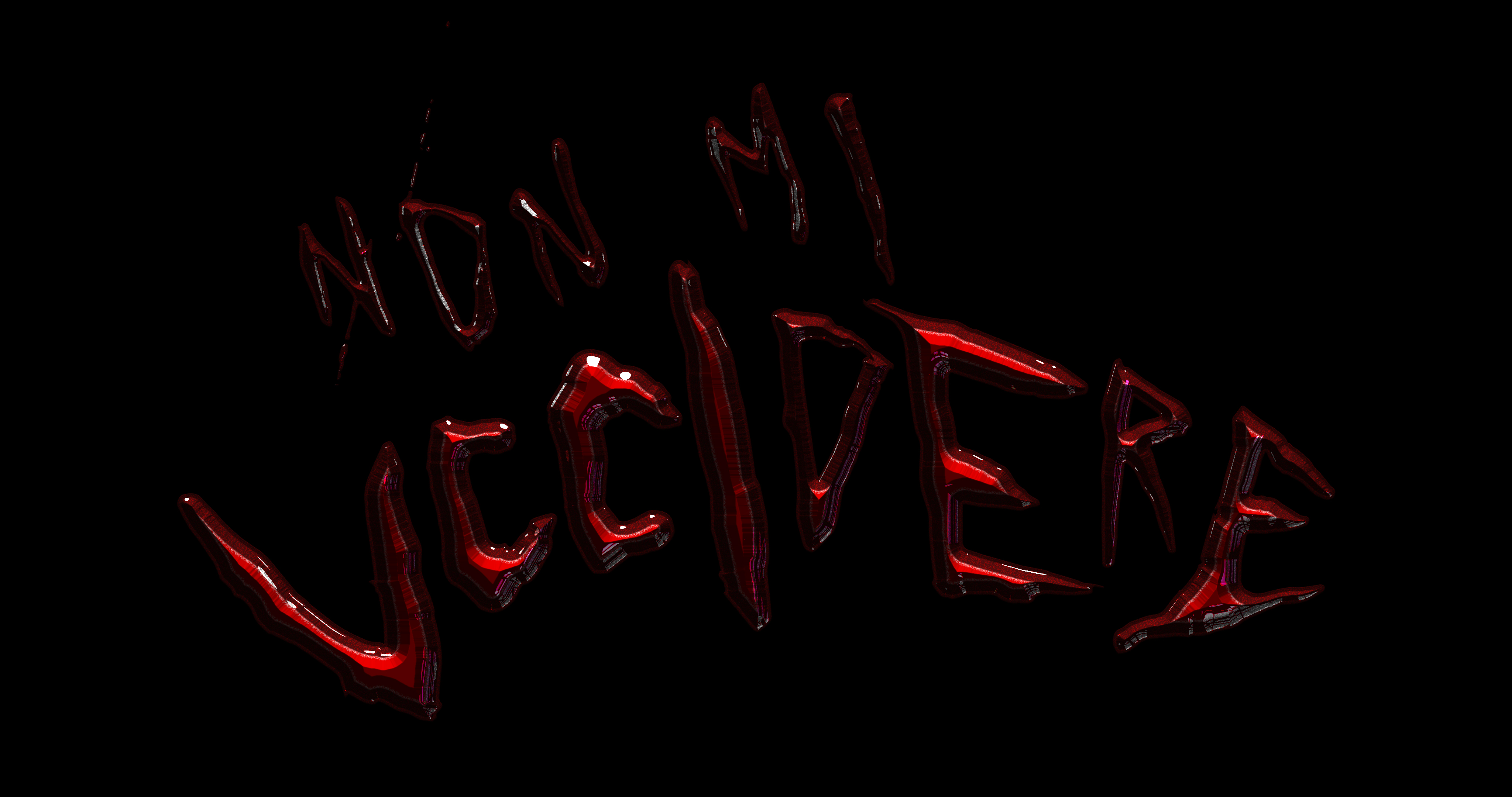
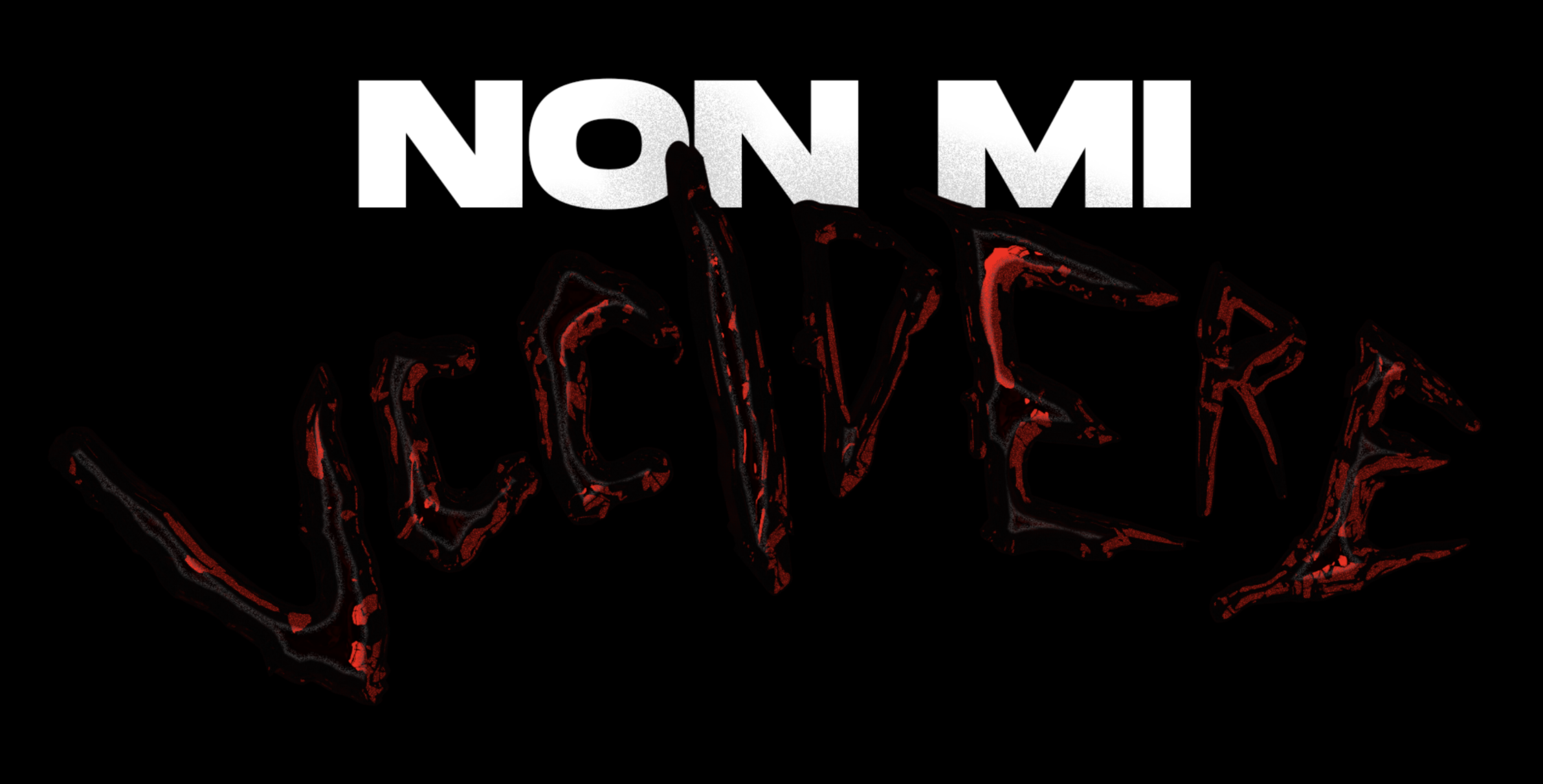
The final result is keeping the sans minimal and straight forward typography, removing the handmade type - as too connected to the Horror movies clique - and applying on it the decay process as a point of connection of the before scenes life & death .
- life cycle -
↓
Visual Inspiration
Visual Language
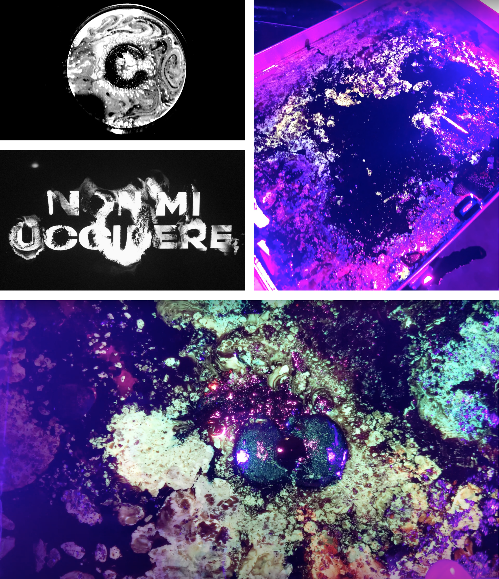
Following the movie scene storytelling, finding visual references to be used in both concept and related language, the biological essence and related life cycle being alterated in a melting and evolving process through the decay and "reborn" has been leading the next step of creative development.
The usage of analogue techniques with ferrofluids and glowing liquids in combination with magnet and physical forces has been adopted. Recording all the random creations of given by the different density and material composition with UV lights - all the clips have been used as the background of the entering seuqence and closing tiltes.
The same appraoch has been translated in the above logotitle creting a coherent connection as holistic concept applyed.
Credits
↓
Movie Director → Andrea de Sica
Production Management → Filippo Conti (unit manager) Claudia Cravotta (unit production manager) Monica Verzolini
(post-production supervisor)
Title Design → Gianpaolo Tucci
Editing → Itaru Yasuda
Camera recording → Cesare Zomparelli